|
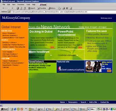
Often I am asked to not design
but RE-design - to take an existing design and change nothing,
while fixing "all the problems." I enjoy
doing redesigns - analyzing other's work helps me improve
my own. In this example, the client liked the overall look
and feel, but was unsatisfied with the structure of the different sections of the page. What you see above is my redesign. Putting
the official company intranet site in the bright orange bar
to the left kept it as the "anchor" of the page
while also clearly separating it from the dynamic content
provided by the News Network in the main part of the page.
Separating the more static features section from the news
section creates a clear hierarchy of information, as does
labelling each section with a clear title/description.
|