There was a bit of a discussion on geowanking over the past couple of days about the lovely Chicago Crime site. There was a brief interchange about the value of information design when comparing Chicago Crime and the site from which it draws data – the Chicago Police Department's official Citizen iCAM website. The question is, did the pretty Google map interface make a difference?
The site got slashdotted, and that was the end of checking it out for a bit. Now it's back up. What was interesting about the Slashdottery, however, was the one comment from a Chicago resident who actually used the iCAM data:
When I was shopping for condos in Chicago a few years ago, I looked at the Citizen ICAM [12.17.79.6] site (forgive the slashdotting...), which actually has a somewhat better interface for search, in my opinion. It may not look as slick as google, but it does allow you to look over a range of dates, and the map icons identify the type of crime... It let me see that one prospective condo was right in a corner of fairly low crime, bordered by much higher crime. I could have guessed that visiting the neighborhood, but it was nice to see somewhat empirically.
So let's take a look at both maps:
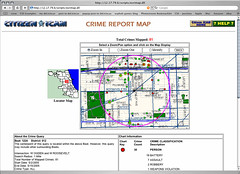
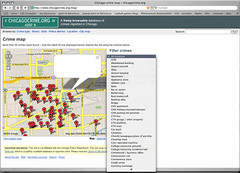
Citizen iCAM, ChicagoCrime.org
Most mapping interfaces assume that the points being mapped (what Mappoint intrusively calls "pushpins") are roughly equivalent. When you think that mapping is about finding the nearest ATM, or dry cleaners, or whatever, the ATMs pinpointed on the map don't need to be represented by different icons. Hence Google's gruesome red balloons, or the loathsome Mapquest red stars, or the horrific Mappoint pushpins.
You can alter the Mappoint pushpins to use different icons. And Worldkit now offers different icon choices as well. But very, very few people ever bother to change the defaults.
So one huge problem, as the case of Chicago crime shows, is that the use of default map icons can create a misleading visual equivalency. If you're looking to buy an apartment, it matters a lot whether those red balloons on the map represent assault and battery, or car theft.
Here's where a little bit of research on why and how people visit the iCAM site would have come in handy.
Another problem, as the commenter mentioned, is the use of time as a search parameter. Again, if you're looking for an apartment, you probably might want to know how frequently crimes occur within a given area. As I know from persistent lurking on the geowankers list, it's pretty hard to work out how to record and represent the passage of time as it relates to spatial location. Yet that's exactly the sort of information people end up wanting.
Another nice trick on the iCAM site, I think, is the purple circle indicating the distance covered by the map. In the case of the map above, the circle's radius is one mile. Again, that's the sort of thing that a resident (or someone just moving to Chicago) might find useful. And it's not something I see on too many online maps.
I find it ironic that the visual design of ChicagoCrime.org beats the pants off the iCAM site. But the police officers who built iCAM understood something that the web designer of ChicagoCrime didn't*: what information matters most to people on the ground.
Google Maps has raised awareness of the potential for improvement in the typical pan-n-zoom experience. But web mapping applications still seem to be at the same level as web design in 1996: waiting for the novelty to wear off so that some design principles can be worked out.
*I'm beating up on ChicagoCrime.org more than I think is necessarily fair. When you hack a new API that's not really intended for outside adaptation, you kind of have to roll with what it offers by way of functionality. Nevertheless, I think the critique stands as a fair one of the kind of default assumptions many people make when they start working with maps.
